I had the privilege of joining Elliot's team at the beginning of the year. With a strong initial bookmark design and a blossoming grassroots campaign supported by the community, I knew this work would be fun and meaningful.
Elliot already had a strong idea for his brand identity, including colors, verbiage, and a bookmark design that we used as the starting point for our collaborative work.
With a bit of typography and great feedback about how the existing bookmarks were being used in real-world applications, we aligned on base brand elements and updated the bookmark. Definitive colors, strong primary typeface and handwritten secondary typeface, an impactful wordmark, and a charming quill logo set the foundation for the Elliot for Spokane 2026 brand identity.
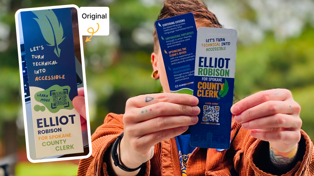
Bookmark: Client's original design (left) and final redesign (right)
The wordmark is, in my opinion, one of the most important elements of campaign branding. Dynamic and recognizable, from the smallest applications on buttons to the largest applications on yard signs, the wordmark needs to be flexible and resilient in how it scales. For me, this means a lot of upfront considerations with regards to design construction.
With Elliot's wordmark, I primarily focused on modularity, recognition, and consistency.
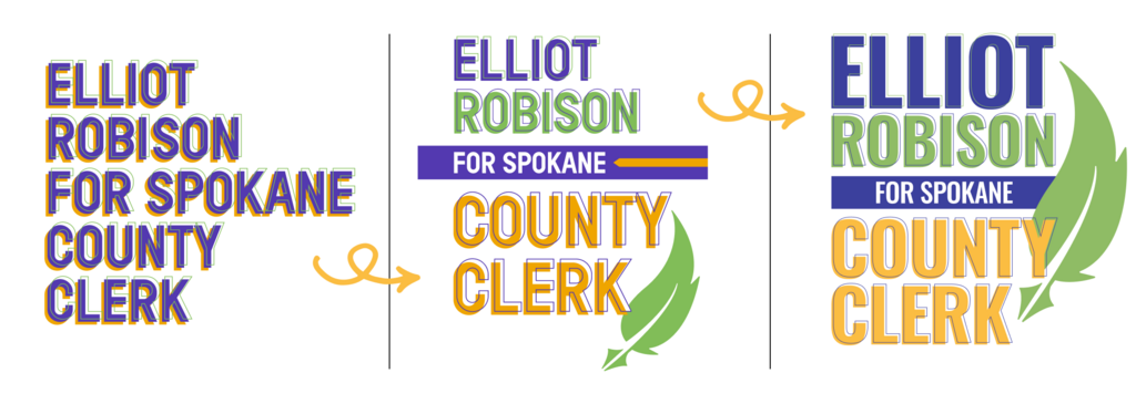
Evolution of Elliot's wordmark: Exploration (left), Initial Concept (middle), Final (right)
In early brand explorations, I created a simple illustration of the The Monroe Street Bridge to add an element to the brand system that would create depth and softness, counterbalancing the typographic structure of the wordmark.
As we built out the brand and applied it to the bookmark, the team voiced a need for something a bit more tailored. We decided on the county courthouse, an immediately recognizable landmark perfectly aligned to the County Clerk position. I created the illustration and it helped add so much depth and graphical interest.
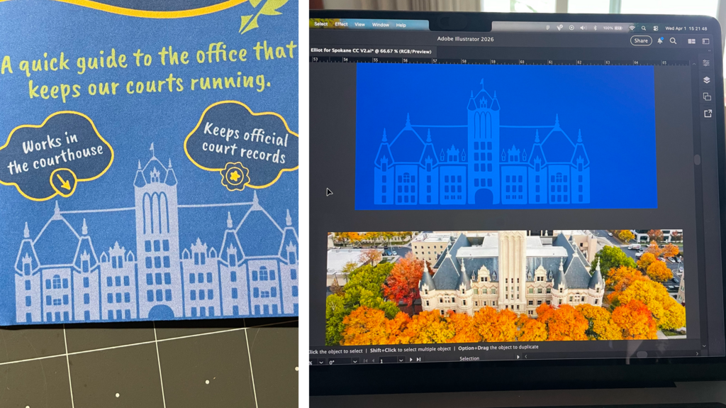
County Courthouse illustration printed (left) and in the process of illustrating on the computer (right)
With Elliot's core brand elements in place, we started putting the brand into practice by applying it to our first outreach materials: Buttons! The first set features two branded buttons with Elliot's campaign typography and the campaign tagline. The second set features two variations of union-focused designs.
Print work was done by Lawton Printing and we created space in the design so the union bug could be placed as primary element in the design! After printing, I handled button assembly.
Union-printed, community-assembled! Truly worker powered!
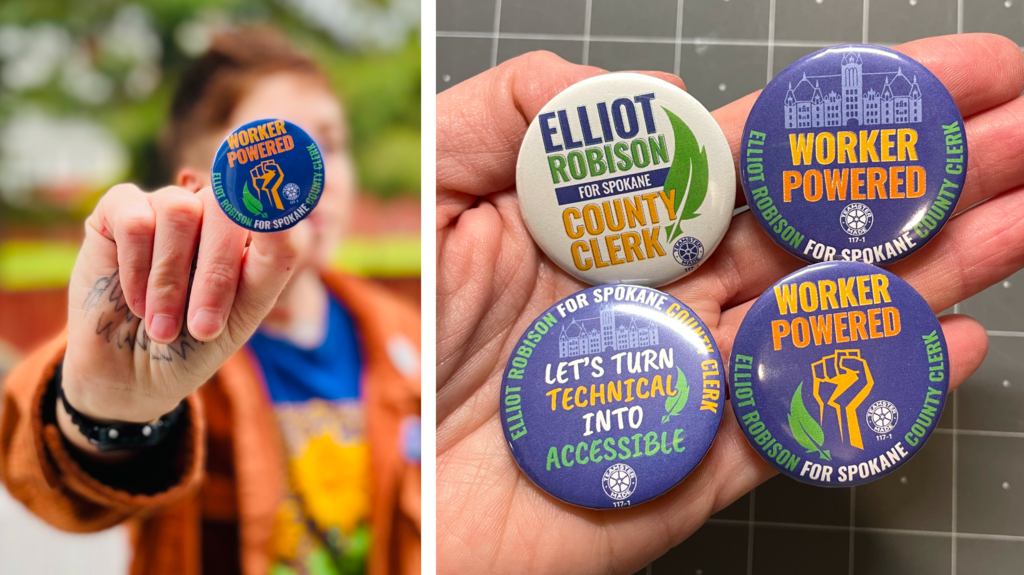
Union-printed, community-assembled buttons
As our buttons and bookmark proved to be successful outreach materials, it was time to tackle the website! The site is simple and incredibly functional, communicating a lot of information elegantly, directing site visitors efficiently, and providing a digital hub for all things Elliot for Spokane County Clerk!
We treated the site as an intersection for all of our community members, laying clear and dedicated paths for each type of visitor through microcopy in the navigation and impactful calls-to-action throughout the site. Whether a visitor wanted to donate, volunteer, or just see what Elliot is all about, they can easily do so through the website.
We built the site in a usable way, so either myself, Elliot, or any other designated person could jump in and make edits. This flexibility meant that communications with our community could be done quickly and allowed website updates to be a team effort.
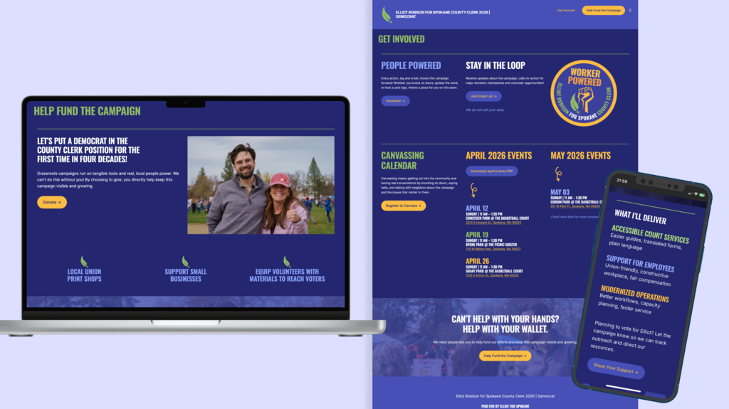
Website page in a laptop mockup (left), free-floating website page (center), mobile phone website page (right)
Two standout pieces that really push the limits of Elliot's brand identity are the t-shirt and the yard sign.
We felt strongly about the t-shirt being a piece of apparel that people would actually want to wear outside of the campaign context, so we wanted to do something more than just the brand typography. Elliot's love of plants is a quiet and underlying theme of the campaign and I felt this would be a great opportunity to bring that to the forefront. I grabbed a photograph that Elliot had taken of Arrowleaf Balsamroot (Balsamorhiza sagittata), a plant native to Spokane, and created an illustration based on it. The joyful colors, playful background pattern, and flower theme are meant to capture the positive energy that surrounds Elliot's campaign, with community members working together in hopes of doing some good. This shirt was screen-printed locally by Corporat Industries.
In constrast to the creative freedom of the t-shirt design, the yard sign was a very constrained piece. We leaned into the utility of what a yard sign was actually meant to do and how it would exist in the environment. We made considerations for cars driving by with large primary lettering, as well as people walking by with smaller lettering and more detailed verbiage. I also recommended a darker blue to help with color contrast accessibility and ensure that Elliot's name was readable from a distance. This yard sign was printed by Preferred Labor Sign.
In both of these pieces you can see the brand modularity really shine with the typographic elements in different configurations. The color harmonies pull things together and the brand still remains very recognizable.
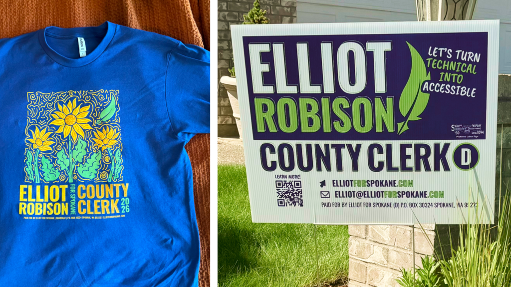
T-shirt design (left) and yard sign design (right)
As I write this, we are gearing up for Pride in a few days! As a queer creative, it is an absolute honor to design these buttons and stickers for Elliot's campaign and I can't wait to get out there and be with my community! Happy Pride 2026!
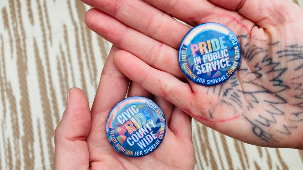
Pride button designs with holographic rainbow overlay
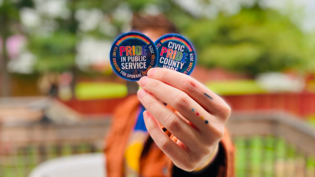
Pride sticker designs with holographic rainbow overlay (hard to see in this photo)
This is just a waypoint in the journey of the campaign. There is still a lot more fun to be had until November when the election happens.
So far the biggest lessons I've learned from this project are:
I can't wait to see what other beautiful outreach pieces we design between now and November and I am so looking forward to making more friends along the way.
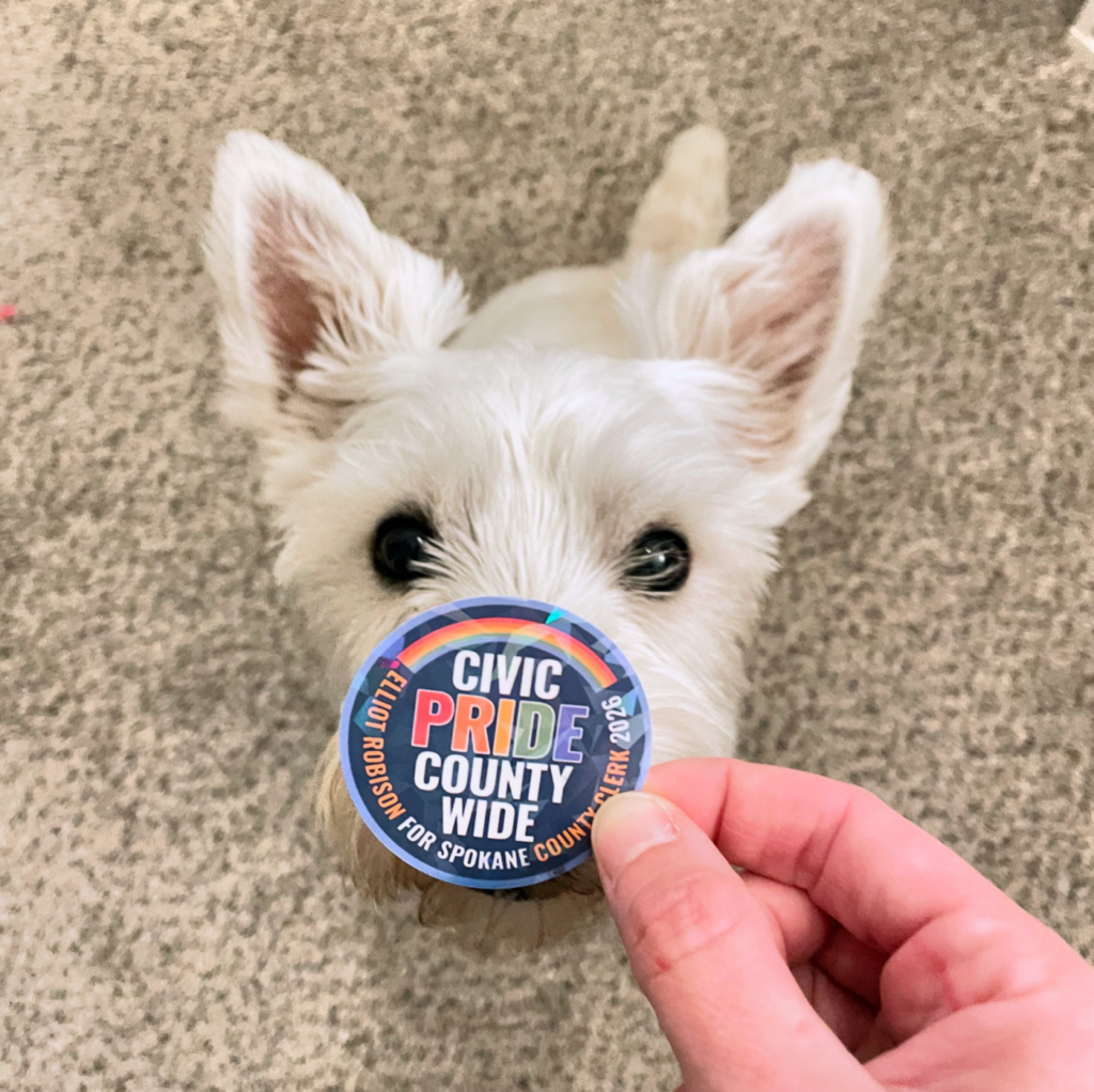
Shop dog nose-boop of approval